As the title implies, this week I focused on modelling pretty much entirely. I know that I should probably focus more on my animation skills (which I will try to do in the coming week!), but modelling can get a stranglehold simply because it's just so fun! I know I quite literally just said that I'm going to focus on my animation more, but that Bzzzt art contest is looking very enticing. And I bet a model of that little robot guy wouldn't take more than an evening to make.
I focused on the persona that I showed last week, but this time it's actually coming together instead of just a simple base mesh.
Because I only worked on a single model this week. I figured it might be fun to show the process of how it's gone so far.
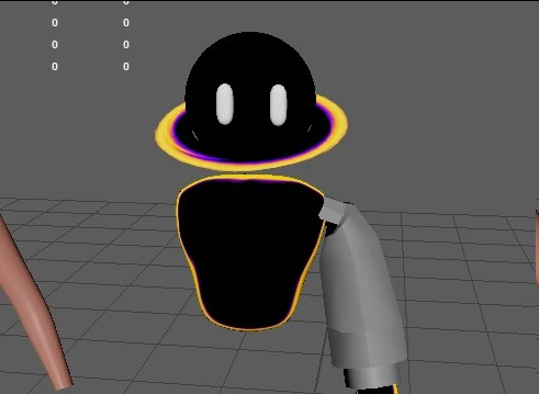
The image below is around the start of the modelling process. I amputated the base mesh that's built in with Maya and enlarged the hands and fingers to get the style that I want out of this. I sort of want to go for what someone might do with a 2D art style with exaggerated proportions. However, the legs have so far been a little bit of a challenge. I simply can't get the look that I want with them. The torso was taken from an alien mesh that's also in Maya. I liked how that looked compared to the human mesh. I'm considering not combining the torso and legs, but that might change in the future for the sake of making the body look more full. The head is where it starts to get a lot more interesting. I want to give it a sort of black hole looking aesthetic, which is why its got those rings and the void. The texture is made using some ramp texture's in the hypershade, so it doesn't look all that impressive in this image. I also opted later down the line for pill-shaped eyes instead of what I was going for initially. Because....I mean......look at it....I can't believe I was thinking of putting eyelids on this as well...
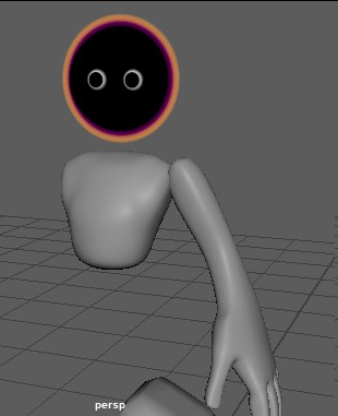
You can see in this image I got the outer rim to look more nebulous that the initial one, and I swapped the eyes for the pill-shaped ones. Also, a cool trick that I tried out was to make the rim follow the camera. I wanted to make sure that it would be visible from any angle that I would point the camera from if I ever wanted to make some animations with the model. I did eventually scrap that idea after I tried out something that I think looks better in the long run. I had the rim parented to the rotational value of the camera so I could this trick done. However, this caused a few problems with it clipping through other parts of the model as it rotated, which is why I decided against it. I also added half of a sphere on the back of the head so that the eyes disappear from view when seen from that angle. This was so it can more easily be told which side is the front and back of the head.
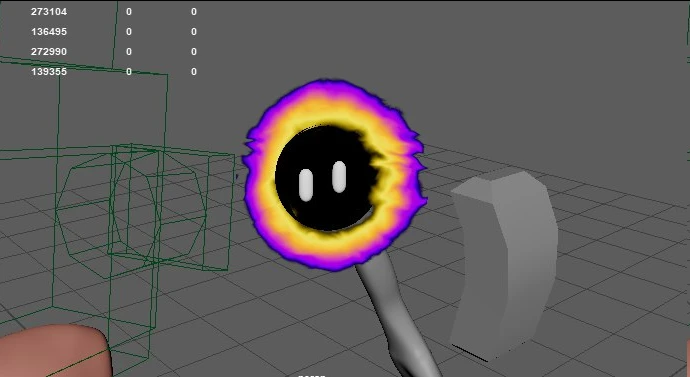
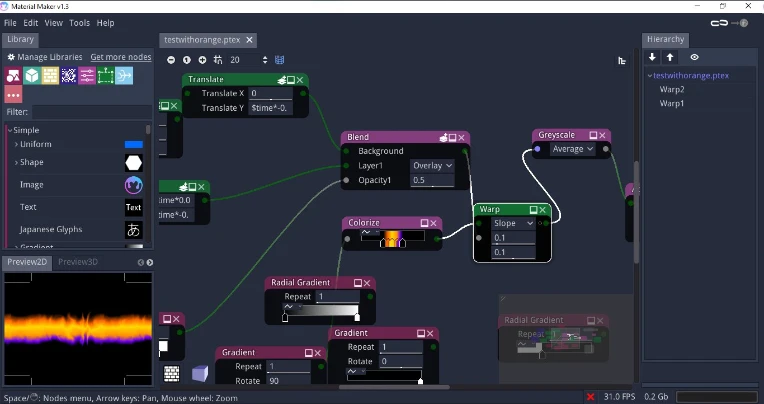
You might have also noticed that the outer rim looks a lot different in this image. This is actually because I decided to try out a program called Material Maker. This is more or less a free and less sophisticated version of Substance Designer. It was honestly a lot of fun tinkering with this and trying to find out how things worked so I could get the effect that I wanted. As a sidenote, there's also a similar program that I wanted to try out called TOOLL3 that I wanted to try out. I kind of overloaded myself with that one though, so I don't know if I would try that out again. I went too deep into the tutorials that they had built in. That one involves way more math than Material Maker too, so that might be why. I think in the end I was able to get a really cool effect (with some extra UV editing).
For the body and limbs, I'm reusing a shader that I made in college for fun. It's a simple shader where the camera's facing ratio (I'm not going to act like I know what that actually means) is used to make some cool effects that are dependent on the angle of the camera. I also have another version of this shader that allows me to have a texture in the blank space of the shader, independent of the movement of the camera. Think of it like that effect that they used on clothing in Chowder, but in 3D.
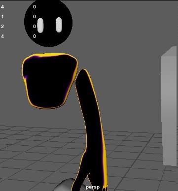
Finally, this is where the model is at right now. Like I said, I changed the outer rim and give it more of a collar look. You can also see that I've started to make a jacket. The clothing is going to take a long time, I think, so I might leave that to much later. The texture for the rim also looks different. This is using the material that's in the screenshot of Material Maker earlier, but with some extra details. Instead of a 4 point plane as the mesh like I did during the beginning, I instead used one with 8 points and with a hole in the middle. This allows me to get better control on how the texture looks like in 3D space. A neat trick that I used to make it look more swirly was to unwrap the UV of the mesh in a straight line and just tilt the top to one side. Because the texture is infinite, it doesn't make any seams and still keeps the effect that I'm going for. Of course, the texture is also animated, so it looks really nice in motion as well.
I'm really happy with how this is shaping up! I don't know how long it will be until I finish it, but I'll be sure to give updates for when I make any progress on it. My plans for the coming week is to whip up a model for that art contest, and to work more on some animation. I've been neglecting animation for a little bit to be honest.
Thank you and good-bye for today!